
The Power of Color: Why a Cohesive Color Palette Matters in Your Home
How the right colors create harmony, influence mood, define your style, and turn a collection of rooms into a home that feels thoughtfully designed.
Kelly Made Home | Interior Design Blog
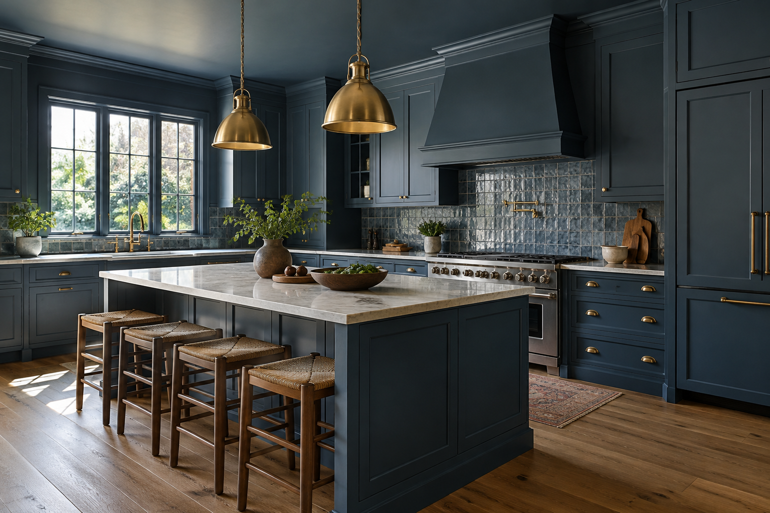
Rich, moody blue tones wrap this kitchen in depth and character, creating a space that feels both inviting and refined. The cohesive palette brings cabinetry and walls together, showing how bold color can create harmony while making a memorable statement.
Have you ever walked into a home and immediately felt comfortable, even if you couldn't explain why? Everything just seemed to belong. The rooms flowed from one space to another, the furnishings felt intentional, and the entire home told one beautiful story. Often, a well-planned color palette is one of the reasons a home feels that way.
Color is about more than choosing a pretty paint shade. It shapes how your home feels, how rooms connect, how natural light is experienced, and how your favorite furnishings stand out. A cohesive palette makes design decisions easier and creates a foundation you can build on over time.
Cohesion Doesn't Mean Every Room Has to Match
A cohesive home isn't one where every wall is painted the same color. It's a home where colors relate to one another. A warm off-white in the living room might pair with muted sage in the kitchen, natural oak in the dining room, and a deeper olive accent in a bedroom. Each room has its own personality, but the undertones and repeated colors make the transitions feel natural.
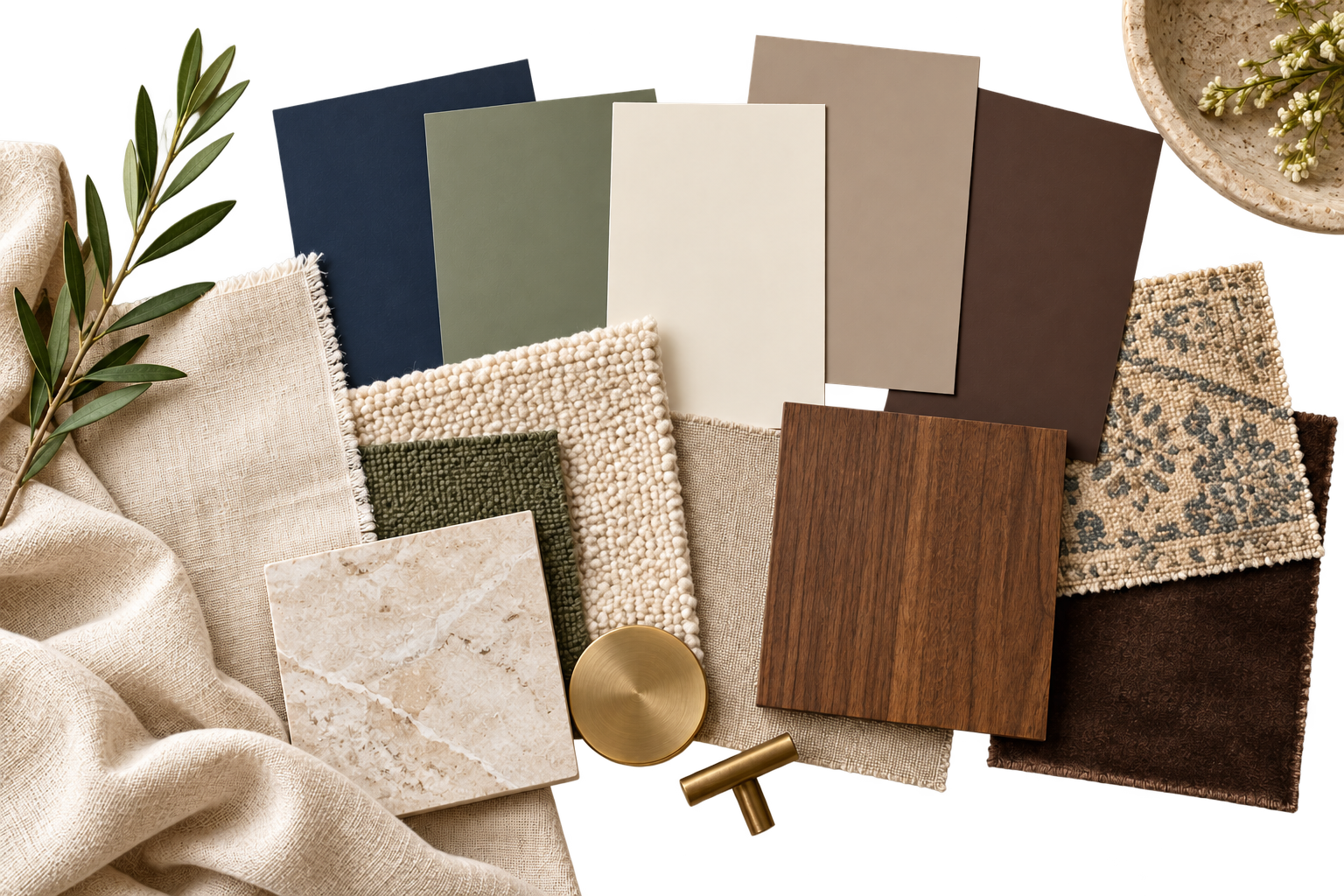
A thoughtfully selected color palette brings balance, warmth, and personality to your home. Coordinating foundational shades with supporting hues and accents creates a natural flow between rooms while allowing each space to feel uniquely its own.
Start with a small family of colors: one or two foundational neutrals, a few supporting hues, and a limited selection of accents. Carry them through the home in varying amounts. Think of it as a common thread rather than a strict uniform.
Interior designer Olivia Song offers a useful way to judge color harmony: “If you were to squint and nothing really stands out to you, that passes the Squint Test.” Her approach considers how colors relate through tone, hue, and saturation, rather than requiring them to match. Source: House Beautiful, reported by Jessica Cherner, October 16, 2025.
Color Changes the Mood of a Space
Color can influence the atmosphere we experience at home. Soft blues and muted greens are often associated with calm and restfulness. Warm whites, creams, and earthy tones can feel inviting and comfortable. Deep navy, charcoal, or rich brown may create a sense of intimacy and drama. Brighter shades can bring energy and playfulness.
These aren't universal rules. Light, texture, color saturation, and personal associations all matter. A shade that feels soothing in one room could seem cold in another. The goal is to ask how you want each space to feel before deciding what it should look like.
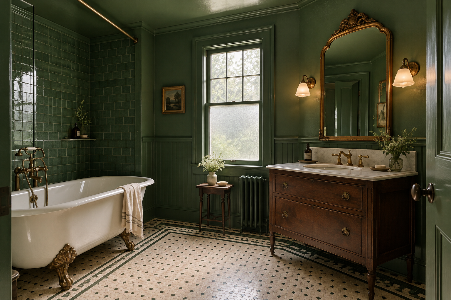
Rich green tones give this vintage inspired bathroom a peaceful, enveloping feel. The color brings a sense of nature indoors, softening the mood and creating an intimate retreat, while the vintage details add warmth, character, and timeless charm.
Undertones Are the Secret to Making Colors Work Together
Two colors can look beautiful on individual paint chips but clash when placed side by side. The reason is often undertone. Whites may lean yellow, pink, blue, or green; grays may be warm or cool; and woods, countertops, flooring, and stone all bring their own underlying colors.
Before selecting a wall color, look at the elements that are already staying: flooring, cabinets, countertops, tile, and large furnishings. Then compare paint samples against those finishes. A cohesive palette connects to the real materials in your home, not just to a photograph online.
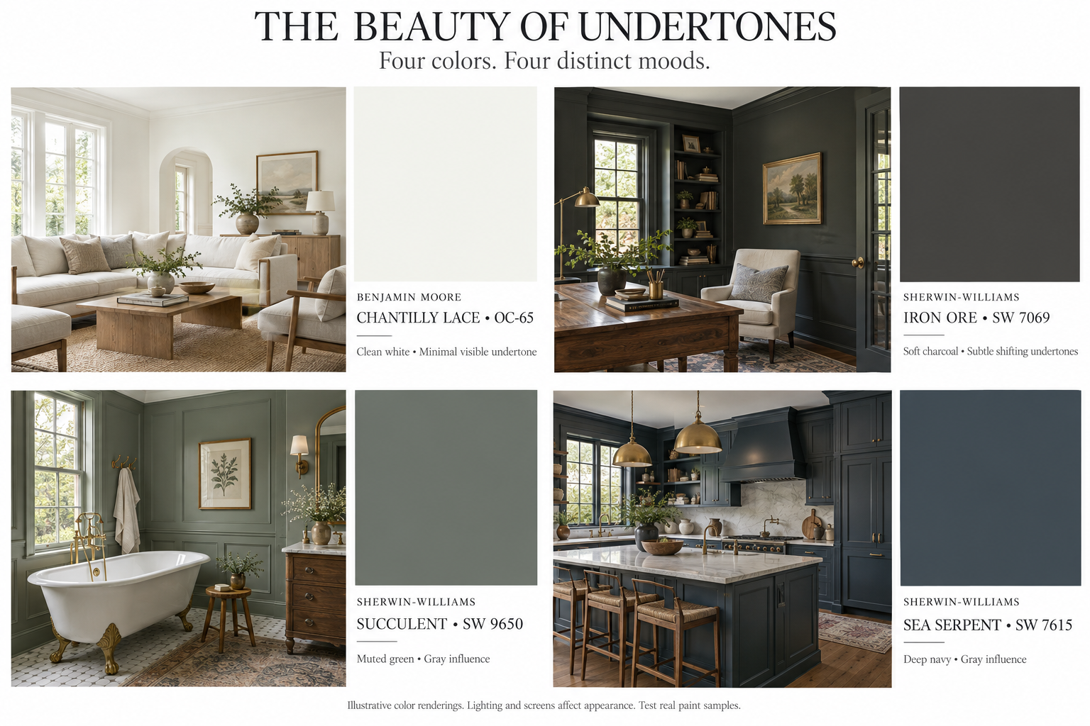
From the crisp white of Chantilly Lace to the soft charcoal of Iron Ore, muted green of Succulent, and deep navy of Sea Serpent, this palette shows how subtle undertones shape a room’s character. Each room illustrates how color interacts with light, furnishings, and finishes to create a distinct mood while keeping the home connected.
Let Your Fixed Finishes Lead
When renovating, some choices are costly or difficult to change. Hardwood floors, stone counters, cabinetry, and permanent tile should play a leading role in your palette. Select coordinating wall colors, upholstery, and accents around them instead of forcing expensive materials to work with a trendy paint color.
This approach is especially valuable in open-concept spaces, where the kitchen, dining, and living areas are visible together. The finishes don't have to be identical, but they do need to have a conversation with one another.
Use Accent Colors to Add Personality
A thoughtful color palette should not make your home feel flat. Accent colors are where personality shines. Try repeating a muted terracotta through pillows, artwork, and pottery, or bring in deep green through upholstery, botanical prints, and painted cabinetry.
Accents can also change with the seasons. A neutral foundation gives you the freedom to swap pillows, throws, flowers, and decorative objects without redesigning the entire room.
As Johanna Lyle, founder and principal designer of Jo Lyle & Co, puts it, “I think a mid-tone neutral is always a safe bet in a living room.” In the featured room, an oatmeal backdrop supports navy and mustard accents, illustrating how a quieter foundation can give stronger colors room to shine. Source: House Beautiful, reported by Alyssa Khan, September 11, 2026.
Balance Color With Texture, Pattern, and Light
A room built around cream, beige, and taupe can still feel rich and layered. Mix materials such as linen, oak, wool, leather, stone, and metal. Vary texture and sheen, then add pattern in smaller doses. These details make a restrained palette feel intentional rather than boring.
Lighting matters just as much. A color that looks warm and inviting in a bright showroom may look entirely different in a north-facing room or under an artificial light bulb. Test large samples on multiple walls and look at them in morning, afternoon, and evening light before committing.

Warm hardwood floors, white cabinetry, and textured stone establish the palette for this open concept home. Soft neutral upholstery, cognac leather, and muted green accents build on those fixed finishes, connecting the kitchen, dining, and living areas with warmth and harmony.
Make the Palette Reflect the Way You Live
Your home should work for your actual life. Families with children or pets may prefer forgiving upholstery colors and durable finishes. Someone who loves a peaceful retreat may choose lower-contrast bedroom colors. A household that gathers frequently in the kitchen may want warmth and energy in shared spaces.
Design is not just about what photographs beautifully. It's about creating a home that supports daily routines and feels like the people who live there.
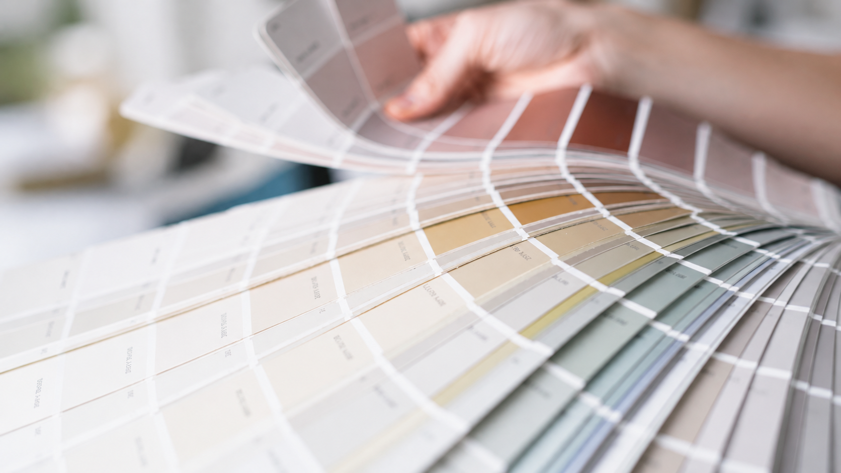
A Simple Way to Build Your Whole-Home Palette
Find your inspiration. Gather a few images, fabrics, or meaningful objects that reflect the atmosphere you love.
Identify what stays. Lay out samples of flooring, cabinetry, countertops, stone, and other fixed finishes.
Choose a foundation. Pick a versatile main neutral that complements those existing materials.
Add two or three supporting colors. Choose hues that share compatible undertones and work across adjoining rooms.
Select your accents. Use furniture, artwork, textiles, and accessories to bring in personality and contrast.
Repeat with variation. Carry key colors into neighboring spaces in different proportions so rooms feel connected but not identical.
Test in your home. Observe physical samples under your own lighting before making final decisions.
One familiar design guideline is the 60–30–10 approach: approximately 60% dominant color, 30% secondary color, and 10% accent color. It's a helpful starting point, not a rule you must follow. Texture, architectural details, and personal preferences may call for a different balance.
Your Home Should Tell Your Story
A cohesive color palette is not about following the latest trend or painting every room the same shade. It's about creating flow, making confident design decisions, and building a home that feels calm, welcoming, and uniquely yours.
At Kelly Made Home, I believe great design begins with understanding how you live. From choosing finishes that work together to helping you avoid costly renovation decisions, the goal is not simply to create beautiful rooms. It's to create a home that looks good, feels right, and works for the people inside it.
Ready to bring your home's colors together? Kelly Made Home can help you develop a practical, personal palette that connects your rooms and reflects your style.
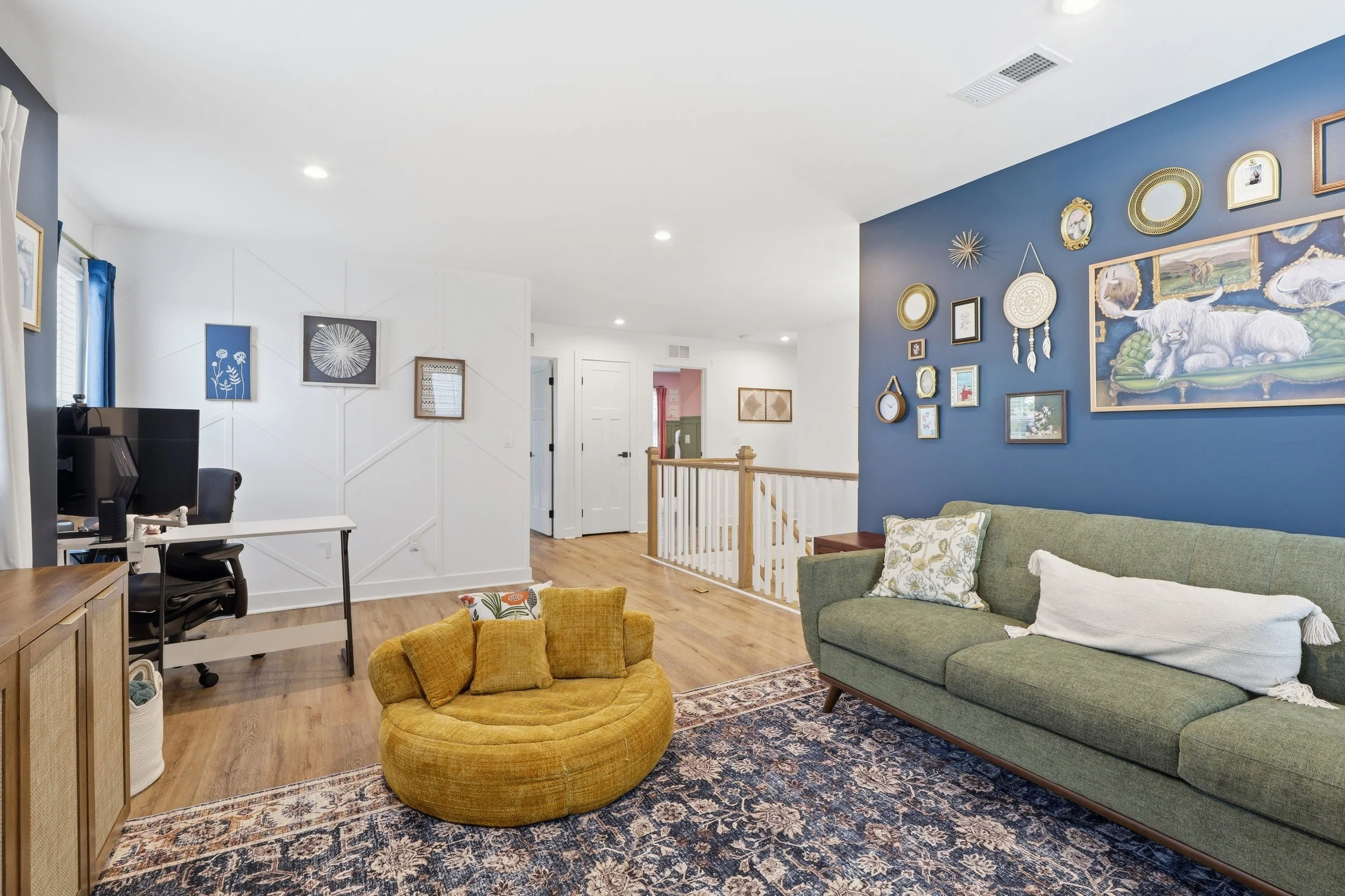
A deep blue gallery wall, sage green sofa, and mustard yellow chair bring personality to this bright living space. White walls and warm wood floors balance the bold colors, while a patterned rug ties the palette together for a room that feels layered, inviting, and expressive.
Sources
Jessica Cherner, House Beautiful, October 16, 2025. Olivia Song on the Squint Test.
Alyssa Khan, House Beautiful, September 11, 2026. Johanna Lyle on living room paint colors.
Designer quotations are attributed to their published sources. The surrounding guidance and examples are Kelly Made Home editorial content.